Build one artifact teams actually reopen
Most product teams don’t fail because they lack documents. They fail because decisions get scattered across PRDs, Slack threads, Jira comments, and meeting notes. Weeks later, someone asks: “Why did we choose this approach?” and the answer lives in five places, none of them authoritative.
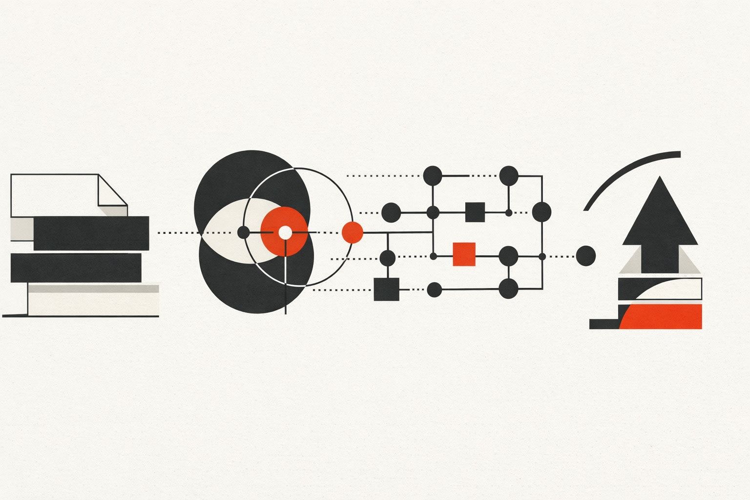
A “Decision Log” diagram solves that by turning a feature spec into a single visual map of what was decided, why it was decided, and what assumptions must remain true for the launch to succeed. Unlike a PRD, it’s not meant to be exhaustive. Unlike meeting notes, it’s meant to be reused—during implementation, QA, go-to-market, and post-launch review.
What a Decision Log diagram is (and what it is not)
A Decision Log diagram is a compact, structured visual that connects four things:
- Context: what problem the feature solves and for whom
- Decisions: what you chose (and what you ruled out)
- Evidence: what inputs justified the choices
- Consequences: what changes downstream (tech, ops, GTM, risk)
It’s not a replacement for a PRD, design file, or architecture doc. It’s the “index card of truth” that points to those deeper artifacts and preserves reasoning.
Start with the PRD and extract only what changes outcomes
1) Lift the goal and constraints, not the narrative
From the PRD, pull the smallest set of statements that constrain decisions:
- Success metric (e.g., activation lift, time-to-value reduction, churn reduction)
- Non-goals (what you will not solve in this release)
- Hard constraints (compliance, latency, platform limits, staffing, deadlines)
These become the “header” of the diagram and prevent scope arguments later. If a new request violates a constraint, the diagram makes that visible immediately.
2) Convert requirements into decision points
Most PRDs list requirements like “support SSO” or “send webhooks.” A Decision Log reframes them as choices with tradeoffs:
- “SSO: SAML only vs SAML + OIDC”
- “Webhooks: at-least-once delivery vs exactly-once simulation with idempotency keys”
- “Rollout: feature flag ramp vs big-bang release”
This is where engineering, product, and security can align without rewriting the PRD.
Use a repeatable layout so every feature log looks familiar
The teams that reuse these diagrams standardize the frame. A practical structure is a left-to-right flow with consistent node types:
- Problem node (one sentence)
- User impact nodes (primary persona + key journey step)
- Decision nodes (the actual forks)
- Rationale nodes (evidence: research, tickets, data, constraints)
- Risk nodes (failure modes, security, deliverability, analytics integrity)
- Launch checklist nodes (what must be verified before release)
Once this template is stable, the diagram becomes a shared language across squads.
Capture the “why” with evidence that survives personnel changes
Most teams write down what they chose. Fewer write down what made it true.
For each major decision node, attach a short rationale that is concrete enough to revisit later:
- Quant: funnel analysis, support volume, latency benchmarks
- Qual: interview findings, sales call themes, usability test clips
- Operational: on-call load, infra cost projections, compliance review notes
Keep rationale short, but always link to the deeper artifact (doc, dashboard, ticket). The diagram stays readable; the evidence stays findable.
Make launch readiness part of the same diagram
The reason teams don’t reuse specs is that specs often end at “build.” A Decision Log diagram earns its place when it reaches “ship” and “operate.” Add explicit pre-launch checks as nodes connected to the decisions that created them. Examples:
- Deliverability check: If the feature sends email, include a verification node for domain/auth alignment and warmup signals. This prevents the common surprise of “DMARC passes but mail still lands in spam.”
- Security check: If the feature involves AI browsing, plugins, or user-supplied URLs, add a node for indirect prompt injection threat modeling and mitigations.
- Reliability check: If the feature emits webhooks, link the delivery decision to idempotency strategy, retry policy, and dead-letter handling.
If you want a deeper operational lens on webhook delivery choices, the patterns in Hardening Internal Webhook Endpoints With Idempotency Retries and Dead‑Letter Queues map cleanly into Decision Log risk and checklist nodes.
Turn the diagram into a living artifact instead of a one-off slide
Version it like code
A Decision Log diagram should change when decisions change. Put the diagram link in the PRD, ticket epic, and release notes. Add lightweight versioning:
- Date + owner for each major decision node
- Status tags: proposed, decided, revisited, deprecated
- A “decision changed” note that explains what new evidence appeared
This prevents the classic problem where the PRD says one thing, implementation does another, and nobody knows when the switch happened.
Keep it compact by enforcing a “one screen” rule
If the diagram sprawls into dozens of nodes, it stops being a decision log and becomes a system map. A useful constraint: the primary view must fit on one screen at 100% zoom. Everything else becomes linked detail.
How to generate a clean first draft quickly
The fastest path is to treat the PRD as input text and produce a visual draft you can edit. Tools that translate text into diagrams reduce the friction of starting from a blank canvas. For example, napkin.ai can take the written decisions and structure them into a diagram you can refine—useful when you want a consistent visual style across teams without requiring design effort.
The key is not the tool; it’s the discipline of extraction:
- Write the problem in one sentence.
- List 5–9 decision points maximum.
- For each decision, add one rationale line and one consequence line.
- Add 3–6 launch checks tied to the riskiest decisions.

What teams get wrong and how to avoid it
They log decisions without alternatives
If you don’t show what was rejected, future readers can’t judge whether the decision still holds. Include at least one alternative per major decision, even if briefly.
They omit failure modes
Launch issues often come from “non-functional” gaps: deliverability, security, analytics, operational load. A decision log that doesn’t include risks becomes a poster, not a tool.
They don’t connect to the release process
If the diagram isn’t referenced in standups, QA plans, and rollout reviews, it won’t be reused. Put it in the places people already look: the epic description, the release checklist, and the incident postmortem template.
When this diagram becomes the default, PRDs get easier
Once teams expect a Decision Log diagram for every meaningful feature, PRDs naturally become cleaner: fewer repeated debates, fewer rediscoveries, and faster onboarding for anyone joining midstream. The diagram isn’t extra work—it’s the glue that makes decisions durable across the entire path from PRD to launch.
Vertical Video